
By Eva Marie Haine
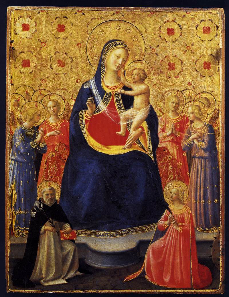
Recently the Verbum blog has been highlighting works of art that are available through the Verbum database. As a complement to these posts on art, I was invited to write a more general post about how to look at and appreciate art, especially sacred art. This is the first in a series of two.
Have you ever walked through a museum, glancing at masterpiece after masterpiece and reading some texts on the wall here and there, and then left without having really looked at anything? Sadly, I think that this describes many of our experiences of great art, whether in a museum or in a book or on the internet.
Although we have a very visual culture, many people nowadays feel uneasy or unsure of how to approach fine art. Among other things, I think this is the result of over-specialization, lack of attention span, and—ironically—of a museum culture, which tells people that great art must be preserved for the masses but presented by an expert.
I feel fortunate to have been steeped in art my whole life because my mother is an artist, and we always had original artwork on display and actively being made at home. Indeed, I think that some of my most useful training in art interpretation came not in my college art history courses but in studio art classes and in making art with my mom. When you understand how art is made and the thought and design process of an artist, it is much easier to engage with it.
How to analyze art
It was in making art that I learned the elements of design, which are typically my entry point into any in-depth study of a particular work. These elements are line, shape, form, color, value, texture, and space. Think of these as the components of a visual composition, the stuff through which an image is made. They are the elements that allow you to describe how a work of art looks, both as a whole and in its parts.
Art historians call this kind of description formal analysis because it focuses on the image or form itself—only that which we can see—and does not assert any interpretation, whether historical, biographical, theological, or social. I believe that all good art appreciation and interpretation begins here, with formal analysis.
Let’s imagine that you have taken a trip to a museum and come upon a painting that you find beautiful and striking. You want to understand it better, so what should you do first? I say: do not read the museum placard (yet). Instead, choose one of those elements of design—line, shape, form, color, value, texture, and space—and begin describing the quality of that element in the painting to yourself (in your head or in writing).
Just as someone who is analyzing a poem focuses not only on narrative content but on the stylistic elements of sounds, meter, etc., so too with art we must attend to the formal qualities of what we see. We can start by observing the following elements. As you describe each to yourself, you will enter more deeply into to the painting’s beauty and meaning.
Elements to notice in art
These elements might seem basic enough, but if you have never looked closely at them before, it might be difficult to know what to consider for each. So, I have written a basic guide to each one and for the sake of example, I have applied each to Rembrandt’s Descent from the Cross (1632-33), recently featured in a Verbum blog post.

Line
Line is very straightforward, but at the same time, there are many kinds of lines: dark, light, heavy, thin, vertical, horizontal, diagonal, straight, squiggly, short, long, perpendicular, parallel, intersecting, etc. In a picture, there may be many actual lines or outlines, especially in depictions of architecture, or few. Sometimes line is suggested by the orientation of figures or objects in the composition. For example, I can think of several scenes of the deposition, or descent of Christ’s body from the cross, in which the limp, horizontal body of Christ is a strong linear contrast to otherwise upright and rigid figures.
In this painting by Rembrandt, the straightly linear and tall cross accentuates the limp and curving body of Christ coming down from it.
Shape
Shape most directly applies to areas of enclosed space described by lines in two dimensions. You might look at the kind of shapes but also their number and whether there is any repetition or pattern. I think of shape also in the sense of overall composition: a shape emerges in the way in which the figures or objects are arranged. Triangular arrangements are fairly common pictorially.
We see this in the Descent: the heads and arms of the two men lowering Christ form a triangle with Christ’s head and arm, with his head as the point. The focus of the whole painting is drawn to this point, so that we understand .
Form
Form takes shape in the three-dimensional. This can be an illusion of three-dimensions, which is conveyed by perspective and shading, or literal three dimensions as in sculpture. Are the forms organic, having no hard edges and irregular, or are they geometric and regular? If the forms are recognizable objects or figures, like a human face, you can still be attentive to the particularities of shape and dimension. Faces can be oblong, rectangular, square . . . you get the gist.
Rembrandt contrasts the rectilinear cross with the rounded bodies, which lack hard edges or outlines, often blending into the background. He suggests rounded edges with soft shading and hard edges with darker shading. In part, the stark difference of the cross’s straight angularity renders it all the more harsh.
Color
Color, like line, is accessible, as it is often one of the first things we notice. Are the colors bright, rich, or muted? Cool or warm? Is the painting generally monochrome, with touches of bright color here and there or almost rainbow-like in its spectrum? Each color carries with it strong connotations and moods, as do certain combinations of colors, so be attentive to the way in which an artist uses color to evoke feelings or associations.
In the Descent, Rembrandt utilizes a very limited color palette, mostly blueish grays and the natural neutrals of wood and skin, surrounded by darkness. We also see the power of the absence of color: the white of the sheet behind Christ heightens the appearance of his nearly-colorless body. Perhaps Rembrandt employs the contrast to emphasize this mystery: How could Christ die? What does it mean for humanity that the Son of God was truly drained of all life?
Value
Value refers to lightness and darkness. What is in shadow? What is illuminated and where is the source of light coming from? Light conveys many things, from times of day to heavenly inspiration. The famous Renaissance technique “chiaroscuro” (literally “light-dark”) made deliberate use of bold contrasts to create a sense of drama and emphasis.
We clearly see chiaroscuro in this Rembrandt, although the source of light is a bit mysterious. It seems to radiate outward from Christ, illuminating those directly below and above him, and helps to indicate his divine identity.
Texture
Texture could apply to the literal texture of the surface of the artwork and its smoothness or roughness. Van Gogh’s paintings obviously had texture in this sense because of the way he applied paint in such thick strokes. Texture can also refer to the depiction of textures, like that of fur or water or foliage. We are often impressed by an artist’s ability to convey the textures of other materials in stone or paint or pencil. To make a painted surface look as though it felt like velvet or feathers—that is almost an alchemical wonder!
Rembrandt achieves many textures: wood, skin, simple and rich fabrics, the feathered turban of the man at the foot of the cross.
Space
Space implies the space of the canvas or surface and the way in which it is filled in. You can look at the negative space around shapes or figures: is it very flat or does it have depth with a foreground and background? Is it quite sparse or very densely filled? Are there clear delineations of space? Is the visual focus concentrated in the top or middle or bottom of the composition? Space can also mean the relation of the pictorial space to our space; some paintings have a very enclosed feeling, while others seem to open out to us, the viewers.
Rembrandt’s painting is very crowded in the bottom half but very sparse in the upper half, which accentuates the feeling of heaviness and falling. We are given a sense of movement, as if truly in the moment of Christ being brought down.
When these elements are held in relation to one another, the artist creates balance, contrast, symmetry, asymmetry, movement, pattern or repetition, rhythm, unity and disunity. You can look to the whole and find harmony in the parts, or perhaps you will find some notes of dissonance. They come together as the “form” of the painting, and this “coming-together” can be masterful, beautiful, enchanting, even sublime. Or, it could be lackluster, dull, chaotic, unfocused, simple, ugly, awkward. By giving you these elements of design, I hope to provide some context also for being able to judge art’s effect and articulate the reasons for it.
I do not mean to either overwhelm or to limit you by these terms. By no means do you need to consider all of the possible elements to appreciate a work well. Pick what is most salient to you and use that as an entry point into the rest of the painting.
These elements are held in relation to one another, creating balance, contrast, symmetry, asymmetry, movement, pattern or repetition, rhythm, unity, and disunity. You can look to the whole and find harmony in the parts, or perhaps you will find some notes of dissonance.
And, at some point in this process of describing, you will begin to have an impression of what it all evokes or communicates. Answering the question “What do I see?” will lead to “What is this painting expressing?” We will consider how to approach this latter question in the second part of this series.